June was a good month

Newsletter_2014_06_v1

June was a good month. One of my images got selected for the GPP "Day and Night" Community exhibition and another image got featured as GPP's Photo of the month. See attached snapshot of the GPP newsletter for June.

The image selected for the exhibition:

Sunset at Malecon, Havana

And this is the image that was featured for the month:

Cuba12

Jay Maisel

An outstanding photographer, Jay Maisel has a career that has spanned over 50 years. His images revolve around light, color and gesture. During my research, I fell in love with his images. I especially like the fact that he shoots whatever he likes - portraits, landscapes, street. He is famous for his portrait of Miles Davis (taken in the 60s, I think) - a beautiful images which is still very relevant today. He was a commercial photographer for a number of years and what distinguished him from other bodies of work was the fact that he never distinguished between commercial work and his own body of work. He is now retired and runs workshops in NYC. I would so love to attend one of them. That would be quite the dream workshop.

I have collected some of his images for my learning log. They are wonderful, vibrant with color, beautifully composed and interestingly enough, he doesn't really post process much. These images are more or often than not straight out of the camera.

I enjoyed reviewing his work, reading and watching some his interviews. Kelby training has a wonderful webcast " a day with Jay Maisel" which is well worth watching as well.

His work can be seen on his website.

Yusuf Karsh - portrait photography extraordinaire

yousuf_karsh_02.jpg

Yusus Karsh (1908-2002) is one the most extraordinary photographers that I have come across.  Primarily a portrait photographer, he has photographed a many important personalities from political figures to actors and musicians and athletes. His body of work is simply outstanding. Some of the most beautiful black and white portraits I have seen. He became famous over night when he took a portrait of Winston Churchill in 1941.

yousuf_karsh_01

His website http://www.karsh.org is well worth visiting; My favorite section is the portraits sections where a number of his portraits are depicted  and even more wonderfully each one comes with an anecdote, a remembrance of how that image was taken.

Here is another article I read which talks at length about his work, style and techniques. http://www.sciencetech.technomuses.ca/english/collection/karsh.cfm

I absolutely love his B&W images. They are what I think about when I talk about images which are timeless.

Here's another one of Mohammad Ali and the beautiful Elizabeth Taylor..

yousuf_karsh_03

Monte Zucker's Portrait Photography Handbook

I bought this book to prepare for one of the OCA courses "People and Place". Read the whole thing cover to cover and find myself going back to it repeatedly. A really well written book that covers all the critical elements behind photographing people. The book covers preparing for a portrait session, advice to give clients, talks about locations and backgrounds, posing fundamentals, lighting patterns, techniques and patterns, camera angles, exposure etc etc. This book has given good insight into all the subject matter which has been laid out in the first unit of P&P.  I recommend it highly.

Vivian Maier

IMG_0167

I find it poignant and sentimental, the story of how Vivian’s work was discovered after her death.  Very few people who read about it would be failed to be moved.  Her work discovered in a footlocker had never been viewed by anyone during her life time. Her work is a wonderful repertoire of street photography during the 50s and 60s. I loved how she captured a wide gamut of street scenes – the rich and poor, the old and young, the maids, the workers, the families, the bums – the entire scale of emotion from joy to grief.

A large part of here work has still not been displayed. I read somewhere that there is a huge number of negatives that still remain undeveloped. What I find interesting is how her un-trained eye naturally captured these street images and these images are beautifully composed.

The 50s and 60s have always been an era that appeal to me and I love the work of photographers who were active during that time and so Vivian’s portfolio comprise for me a series of compelling documentary style images. For this particular review, I am not focusing on her street photography but on the series of self portraits that she shot on her journey.  I am reminded of Angiers Rosswell’s chapter “Self Portrait – No Face” from “Train Your Gaze”. Vivian took self portraits in a variety of ways, from reflections in mirrors to reflections on shiny objects, her distinctive profile with the hat and the man's coat caught on film. Often wonderfully composed with layers upon layers, sometimes with humor sometimes brooding but never boring or uninteresting.

A case in point, this image:

IMG_0171

Vivian's shadow reflected on the ground, her profile distinct thanks to the hat she used to wear and layered with in the shadow another self-portrait, this time reflected in the shiny sphere.

Another favorite of mine. I think this one is absolutely outstanding. Another wonderful example of what I mean when write about layers within layers.

IMG_0169

Another one,  a mirror in what I think is one of those long diners that used to be so popular in the 50s and 60s.

IMG_0168

She continued with taking self portraits till much later in life and while the format changed (from square to the more common 3 x 2 formats of today),  she never lost her unerring eye for wonderful compositions.

IMG_0172
IMG_0173

The more I look at her portfolio of self-portraits, the more I am inspired.  I rather like the idea of taking self portraits in this documentary style as opposed to in the studio under contrived conditions. When I wrote about Angiers Rosswell's chapter about self portraits, I found myself uncomfortable with the idea of taking self portraits and since then have been reflecting on why. The only clarity I have is the continued belief that it's fear, fear of what I will see and my unwillingness to confront or accept a reality which could come out differently (negatively) from what I think it should be.

Jordan Matter's Dancers Among Us

dancers-among-us-in-times-square-jeffrey-smith.jpg

I came across a wonderful collection of photographs from the New York based photographer, Jordan Matter.  The project is entitled "Dancers Among Us" and it features an amazing set of images in which Matter invited dancers to act out various characters and jump around in New York city doing some humorous poses. The images have been published without the use of any post processing and the results are simply outstanding. In his website, Jordan Matter explains how the inspiration for these images came from watching his three year old play with his toys. Over a period of three years, he has managed to put together this amazing and joyful collection of images that absolutely delighted me. It's really inspirational and I really wish I could come up with a photo project like this. At the very least, it has started me thinking about a new direction and I hope I can come up with something equally inspiring. The whole collection is wonderful, colorful and creative. I loved them all. Here are some of the images and you can see the rest on his website www.dancersamongus.com; The website also features a wonderful videos that shows some of the behind the scenes action that went into putting this project together. Just brilliant!

Dancers-Among-Us-in-Times-Square-Jeffrey-Smith

Dancers-Among-Us-in-San-Francisco-Jamielyn-Duggan33

Dancers-Among-Us-in-Maryland-Rachel-Bell19

Evgeniya_Chernukhina_Philadelphia_Dancers_Among_US

Jonathan has also published a book which is available on amazon and I have ordered one. It's really reasonably priced and I am looking forward to reading / viewing it.

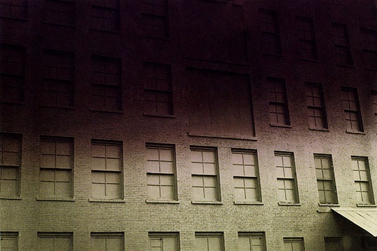
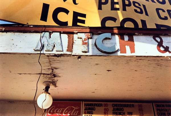
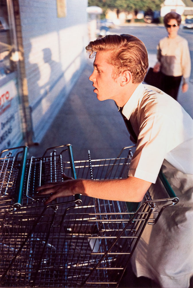
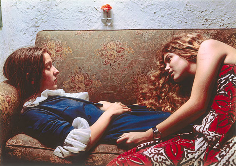
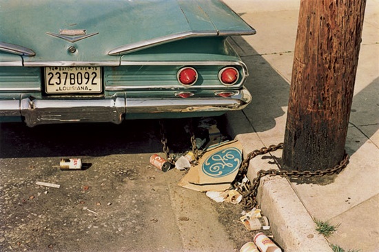
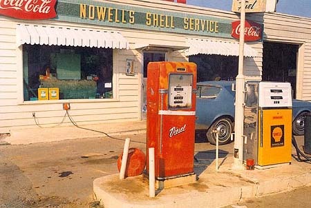
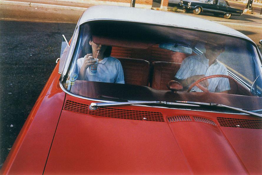
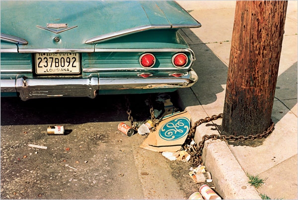
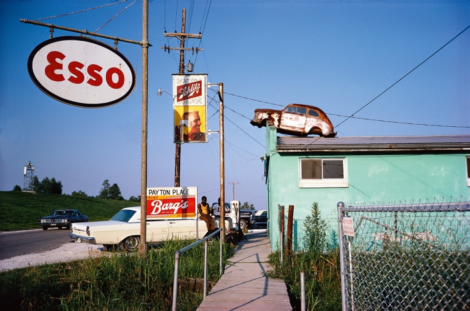
William Eggleston

election_eve_n.jpg

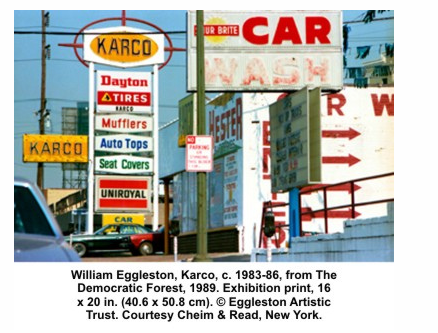
William Eggleston (born 1939) is mainly known for bringing color photography to new heights from the 1960s and onwards. I am somewhat conflicted about his work.

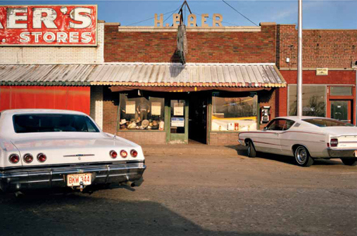
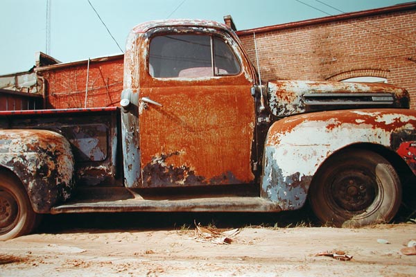
While his effective use of color as a key element of his images is without doubt, his subject matter is ordinary life.  Eggleston predominantly photographed American South, there are cars, bars, gas stations, fields, supermarkets, fast food, lost souls, dreamy stares, signs, streets, reflections… All of which constitutes the essential everyday life for many of us, even if we’re far away from Eggleston’s Memphis.

My first reaction to Eggleston was, and I think to a certain extent still is, quite mixed.  While I found several of his images compelling, there were many that I found to be almost uninteresting. I am sure that there are many who may find this view to be almost blasphemous. I am not taking away from the fact that he was a pioneer in color photography and that many of his images are wonderful to see from a color, composition and documentary point of view, but given that he photographed every day life, why is it inconceivable to think that it may be possible for an element of banality to creep into some of his images? I have to admit that some of the images which first struck me as being boring proved otherwise the second or third time around but there are still a few which I find uninteresting and frankly, fail to understand why they are feted as being so highly commended.

In any case, I am not sure I am in the mood for a major debate, suffice to say that I  agree with Peter Schjeldahl when he wrote about Eggleston at the Whitney

“You can always tell a William Eggleston photograph. It’s the one in color that hits you in the face and leaves you confused and happy, and perhaps convinces you that you don’t understand photography nearly as well as you thought you did.”

ll that aside, what does appeal to me is that Eggleston found beauty in the commonplace, almost junky situations. I also have a bit of a love affair with ordinary common place settings so I can relate.

These are the some of the images I really like.


Photographer Review - Steve McCurry Revisited

screen-shot-2013-03-17-at-7-55-50-pm.png

Screen Shot 2013-03-16 at 1.46.58 PM Steve McCurry’s work continues to inspire; while doing TAOP, I had reviewed his work in the context of beautiful use of both composition and color. In context of P&P, his work continues to inspire. For the last two years, I have just been puzzling over how he manages to take such compelling images especially with regard to color.  His images are wonderfully powerful. The colors are vivid.

I wish I could attend a workshop with him just to see him in action; The closest I got was through viewing a short film “Close up:Photographers at Work”; From what I can gather that a lot of his iconic images were shot on slide film although the short film did show him shooting with digital film. I found it amazing that he carried around such a large camera for street photography and no one seemed to notice him. (http://www.youtube.com/watch?v=NLgd6isBAoM)

Recently I has the chance to view some of the photographs that are in featured in his new book “Steve McCurry: The Iconic Photographs” and I continue to be overwhelmingly impressed. Here are some of my current favorites (I just seem to be adding to one more to my collection of images everything)

I also spent some time watching his one master class series which can be found on:

Some of the tips that I picked up:

-       Don’t’ forget to say hello; connect with the subject

-       Be in the Moment – take the time out to get the sense of the place / street. Look at the architecture, at the people, take some time out to get to know the place. Photograph alone or with one person so that you can focus on your surroundings and not get distracted. Photography is really a solitary endeavor; it gives you the opportunity to explore

-       Humor goes a long way – when approaching people on the street, you need to try to connect with them; show respect.

-       React Quickly – seize the moment; follow your instincts;

-       How to fit on street – This relates to when you go to a foreign country; go with a guide; somebody who knows the culture; this way you are able to gauge what happenings and is watching your back. It also belps to build a sense of confidence and ensure you don’t culturally disrespect people.

-       What makes a great photograph – Good composition and color but the main thing is that it should have some story telling or have some element that you can’t forget. Pictures that stay with you and change your viewpoint about the world.

-       Follow your nose – a good photographer needs to have a strong sense of curiosity about the world; go with your instinct; be ready to explore

-       Pick an Unusual Vantage – try and find different viewpoints to shoot from; high / low etc.

Some of recent favorites:

Screen Shot 2013-03-16 at 1.57.20 PM Screen Shot 2013-03-16 at 1.59.31 PM Screen Shot 2013-03-16 at 1.59.10 PM Screen Shot 2013-03-16 at 1.58.18 PM Screen Shot 2013-03-16 at 1.57.49 PM


Screen Shot 2013-03-16 at 2.04.37 PM

Photographer Review - Alan Wilson

alan-wilson-1.jpg

Alan Wilson 1 In December 2011, while researching websites for The Art of Photography, I came across a website on street photography by Alan Wilson. I found myself really enjoying his images and I thought a number of them were very compelling. From time to time, I go back to his web-site but I have been unable to see any additions to his already published portfolio. Having said that, I had done quite a detailed post on some of his images. I still think it worth checking his web-site especially in light of P&P

Link to Alan's Website:  http://www.streetphoto.fsnet.co.uk/

Link to my original post: Click here

Train Your Gaze 3 (People at the Edge of the Margin)

I was really quite enthralled by this chapter; The idea being to reject the need to place a subject in the center of the frame and the rejection of the assumption that the subject should be at the center of the frame. The latter is attributed to “photographic folklore” and is actually based on the way the camera design. The book refers to the focusing rectangle using located in the center of the frame. Typically you would aim that focusing rectangle at some part of the subjects face, focus and then take the picture. Interestingly enough I think that modern DSLRs, with their capability to move focus points around the frame, have allowed contemporary photographers to do away with that stereotypical framing. Having said that, I have recently acquired a range finder and found myself framing shots within the center of the frame because I could not technically figure out how to focus lock on the subject face and then reframe the shot. It’s something that I am still trying to perfect so I can fully understand how the tendency to place subjects in the middle of frame came about. Having said that, the reason why I am having trouble moving the frame around while using the rangefinder is because I want to try and make sure that the subject is sharply focused. Imagine my surprise when this chapter then wenton to challenge the concept of portraits where the subject is tack sharp. I find myself really liking the idea of framing people at the edge of the frame. It feels more dynamic, much more compelling compositionally.

I found the Jacob Riss example quite interesting. Although the composition was not deliberate, more an accident since Jacob Riss did not have an optical viewfinder which would have allowed him to compose the image more thoughtfully, the accidental capture of his hand at the edge of the frame results in an image becoming more meaningful especially in light of the subject.

The chapter then went on to discuss Cartier-Bresson’s work and his view of the “decisive moment”; Every street photographer worth his salt knows about the decisive moments and prays for opportunities where they are able to capture that moment.

I really enjoyed reading how Angiers deconstructed one of the most famous images captured by Cartier Bresson “Behind the Gare St Lazare 1932” ; He pointed out elements behind the image that I hadn’t really noticed before. For example, I had not noticed how the poster in the background showed a ballerina jumping and that the motion almost mirrored the motion of the man jumping over the puddle. I found it equally fascinating when Angiers likened the viewer in the background as a witness similar to the photographer himself. Layers within layers that I had not noticed before.

Prior to this chapter, I had read some material on deconstructing images and the importance of being able to interpret images especially in the context of where and how they are used but to be honest it’s not a skill that comes naturally to me or for that matter one that I truly appreciated.

I understand the need for it. I am not sure if I have the ability to do it without help but something about the way Angiers deconstructed this image clicked in my head.

Maybe, it’s because I love documentary photography and in particular street photography. For me, it’s real and visceral. It speaks to me, fascinates me and keeps me engrossed for hours. Maybe that’s why deconstructing these images makes complete sense to me.

Another point that really resonated with me was Angier’s assertion that Cartier-Bresson composed all this street shots. I have been researching various street photography websites and reading some books on it and so far no where have I picked up the fact that street photography can comprise of carefully composed images. I always got the impression that street photography was akin to hunting or quick draw (wild wild west) where you had not only be alert but quick to shoot and capture the moment.

I am not thinking of trying this approach. Instead of walking around trying to document the world as it passes me by, maybe I should find a location or spot, compose the shot and then wait. Much more Cartier Bressan…I think :)

David Alan Harvey

I had the opportunity to go down to the GPP gallery this week and view the exhibition of photographs taken by David Alan Harvey. David has been a member of Magnum Photos since 1993, and is the founder of Burn Magazine, an award-winning and grant giving online and in print journal for emerging photographers.

The exhibition primarily revolved around selected images from his recent award winning limited edition book (based on a true story) which depicts the vibrancy and cultural energy of Rio de Janeiro, Brazil.

Raw, sensual, fresh, real, and passionate, these photographs reflect a broad demographic spectrum, offering a peek into the lives of the rich, the glamorous, the poor, the humble and the everyday.

dah_slider_feb28

This was one of the images exhibited and I thought it to be a very compelling image. I think one of the reasons was the combination of the pastel colors (pink, blue and yellow) as well the composition. It almost as if I was there sitting on the beach looking up at this girl. I did wonder what segment of society she came from; was she from the rich (and spoilt) class or from the humble and poor (defiant). I couldn't really decide. In the end, I figured it was more the former than the latter; after all she was at the beach eating ice cream and generally enjoying herself.

Not all the images from this book was displayed at the exhibition and I can understand why. It's the Middle East and some of the images would have pushed the boundaries of what would be culturally acceptable I think. I went on the Magnum website and had a look at the entire book;  the book is a "visual novella that takes you deep in.. to a fictional night in Rio". Using that context to view the rest of the images made me think of a night of chaos and unbridled passions (and not necessarily in a good way). A lot of the images had a very confrontational almost harsh depiction of the subjects. Many of the images didn't appeal to me at all; both from a subject matter point of view (too raw; too sensual and sometimes both) as well as the technical style (shot with harsh lighting (flash head on) almost to emphasize the dreariness and desolation of some of the subjects.)

I spent a considerable amount of time looking at them but I could'nt really make up my mind about how I felt about all of them. Clearly the images are compelling otherwise I wouldn't have spent a long time thinking about them but I am not sure I would ever put them up on my living room wall.

The book design is quite amazing. Again, I saw a video showing the layout and it's really quite ingenious.

The exhibition also displayed some of his images from Divided Soul and his new limited edition series but these felt almost tame compared to the kind of imagery that was captured during this "fictional night" in Rio.

Train Your Gaze (1 & 2)

I started P&P by reading one of the recommended books in the reading list, “Train your Gaze, A Practical And Theoretical Introduction to Portrait Photography” by Roswell Angier The book has been divided into 12 distinct chapters covering a range of topics with regard to portraiture.  Each chapter talks about photographing people from different perspectives, gives context and real world examples and then ends the chapter with an assignment. The book is more about process of shooting portraits than about technical skills, although those are covered in the three appendices at the end of the book.

It’s a big book. Literally. Lots of information to absorb and as I work my way through it, I have decided that I will reflect and write up my thoughts as individual posts so quite possibly I may have several on this subject.!

Introduction & Chapter 1:

It never occurred to me that circumstances around asking someone for permission to take their picture could be different depending on whether you are speaking to a stranger or to someone you know. I doubt very much that I would differentiate. I usually walk up to people I know and ask them if I can take their picture. I don’t really say, “ I would like to take your portrait”. Having said that I do agree with Angier’s premise in that the two statements, namely, “I want to take your picture” and “I would like to make a portrait of you” clearly have two separate and distinct connotations. The first being more playful while the latter has a more serious connotation and this, therefore, may influence the behavior of the subject.

Maybe. I am not so sure. It might be cultural phenomena. I find that depending on whom I speak with, the reaction is somewhat different. In the Middle East and parts of Asia, a request to take a picture immediately results in that person straightening him or herself in front of the lens and becoming very serious. Stoicism seems to be the mode. Exceptions are usually when friends are celebrating and very comfortable with each other and that usually results in “hamming” it up in front of the camera. Then there’s the “say cheese” category. The camera comes and they say “Cheeeeese!” I have never seen a good “Say Cheese” image. It often looks fake to me. Sometimes, the subject even looks like they are grimacing instead of smiling.

On the other hand, some cultures are quite comfortable with the idea of having their pictures taken and that comfort usually comes out in the picture. I won’t get into more categorization because I don’t want to be accused of stereotyping. I think it’s more about the how the “privacy” is defined. I love street photography but I live in the Middle East where the idea of someone taking pictures of people on the street especially if the subject comes from conservative [Muslim] backgrounds is seriously frowned on. In fact, depending on whom you take a picture of, it’s a finable and even a jailable offense.

But I digress.

Going back to the book, while there is reference to the process of taking pictures of people, there is also about the presence of the photographer and how he / she interacts with the subject.

Chapter 1, therefore, is entitled “About Looking”. What struck me about this chapter was the reference to a series of images taken by Richard Avedon called “The Family”. Images taken of very important and powerful people, mostly men. Images shot in a very deliberate and confrontational manner. According to Angiers, Avedon would not speak to his subjects while he was shooting. For the entire session he would walk around the room, with a cable release in his hand, staring at the subject but not saying a word. The result was a set of images where you could see the subject re-acting to the photographer’s gaze. Reactions ranging from defiance, seriousness, discomfort, maybe even nervousness. These portraits are referred to by Angiers as being “aggressive personal statements…. It ‘s more about confrontation with the subject acknowledging and returning the photographer’s gaze.” A very interesting concept; Angier’s relates this technique to the early days of photography when due to the slow speed of cameras the subject was to require very still for an extended period of time to get their image on film. Thus, the seriousness and the stiff poses. While that makes sense to me, it’s not something I would be comfortable trying out as suggested in the assignment.

I don’t want to take pictures that have that kind of confrontational element to it. I don’t like it. I don’t think I could stand in front of a subject for 15 minutes much less an hour and not make an attempt to put them at ease.  I thought about the assignment for quite a while. In my mind, I tried different alternatives for possibly completely this assignment but in the end I found myself completely overwhelmed by the whole concept.

Chapter 2: “Self Portrait, No Face”

This chapter begins with a short history of the practice of portrait photography. Angier’s narrates the practice beginning with Louis Daguerre’s announcement in 1839 of having invented a way of fixing an image in a camera. In all of the early explorations into portrait photography, the key element was the face, which had to be visible in all images. What was most interesting to me and very unlike what many contemporary photographers espouse, early portrait photography had very little to do with establishing the character or personality of the subject; rather it focused more on the concept of the persona as a mask. In all of the early portraits (both those displayed in the book and ones I have seen on the web), this is demonstrated by the gravity with which the subjects view the photographer. One has absolutely no inkling about who these people really are. Angier’s then goes on to talk about the work of various photographers who went on to try and reflect more than the outer façade that was presented to the viewer.

From that point he then begins a discussion on the concept of self portraits and examines the work of a number of photographers: Lee Friedlander, John Coplans, Jo Spence and Shirin Neshat. What is common in all of these bodies of work is that the self-portrait in itself do not reveal much of what is behind the image and often the viewers are left wondering about the meaning behind the image. There is ambiguity which “is supported by the absence of a complete face”. In short, according to Angiers, without a face, a portrait may evoke a strong reaction from the view and at the same time thwart any attempts to understand the image itself resulting in multiple interpretations and often leaving the viewer frustrated.

I found that I also had a similar reaction to the body of work discussed in this chapter. Some of the self portraits were quite compelling and intriguing, while others were a bit too graphic and evoked strong reaction from me (not necessarily positive in nature). I can’t say I liked the work of Coplans or Spence. I found their images too confrontational and somewhat disturbing.  On the other hand, I liked Friedlander and Nesbit’s self-portraits. I thought they were compelling enough without evoking over strong negative feelings.

Most interestingly, according to Angiers, if this concept of a portrait with no face is extended to self-portraits, you as your own subject are not in control of how that self-portrait will essentially turn out. You may end up with images of your own self that you do not like or even understand. This premise completely resonated with me. I don’t really like standing in front of a camera. Reading this chapter made me a bit introspective. Why don’t l like standing in front of the camera? I suppose it may be lack of courage to a certain extent (afraid of what I might see and not like) and perhaps to a certain extent also not liking the feeling of not being in control. Maybe it has something to do with self-esteem and confidence? What ever it may, reading this chapter has certainly put me in a very introspective mood.

Ragubir Singh

20130206-023718-pm.jpg

I was recommended by my tutor to look at the work of Raghubir Singh (1942-1999). Raghubir was a self-taught photographer who worked in India and lived in Paris, London and New York and during his career worked with National Geographic Magazine, The New York Times, The New Yorker and Time. In the early 1970s, he was one of the first photographers to reinvent the use of color at a time when color photography was still a marginal art form. His work has been acclaimed for their organization of space and reflect multiple aspects of India at the time. I have to say that I was really struck by some of his images. I loved his color images; they are really vivid and the subject matter is so close to my heart, documentary style street photography. He captures wonderful colors but at the same time his images are evocative and tell wonderful stories. Because of his wonderful treatment I was reminded of Steve McCurry's work which has the same brilliant use of color.

I was also struck by his approach, according to his 2004 retrospective, he created “a documentary-style vision was neither sugarcoated, nor abject, nor controllingly omniscient”. I like that. I don’t see why documentary style photography has to be only about documenting social issues like hunger, poverty, crime etc. It can extend to documenting life (which is often banal) and culture.

Most of images were shot with a small format cameras. He was lucky in that he was able to meet and work with a number of master photographers during his life, including, Henri Cartier Bresson, Robert Frank and Lee Friedlander.

Singh published 14 well-received books on the Ganges, Calcutta, Benares, his native Rajasthan, Grand Trunk Road, and the Hindustan Ambassador car, and today his work is part of the permanent collections of the Art Institute of Chicago, the Metropolitan Museum of Art and the Museum of Modern Art in New York and the Tokyo Metropolitan Museum of Photography, amongst others.

I have only managed to find some of his images on the web but what I saw were very compelling. I love the way he frames his images. A number his images are taken from inside of a car so you can see the view through the windscreen and at the same there is another image superimposed in the rear view mirror. Lots of work with reflections and mirrors which really speak to me.

20130206-023718 PM.jpg

20130206-023730 PM.jpg

20130206-023741 PM.jpg

20130206-023748 PM.jpg

20130206-023755 PM.jpg

20130206-023802 PM.jpg

20130206-023808 PM.jpg

Saul Leither

Another great photographer discovered, Saul Leither was born in 1928 and began taking pictures from an early age. In 1948, he began taking color photographs and his portfolio of color images is what drew me to this man. Saul helped formed “The New York School” of photographers in the 1940s and 1950s. The New York School refers to a loosely defined group of photographers who lived and worked in New York City during the 30s, 40s and 50s. They shared influences, subjects and stylistic earmarks. They were basically street photographers who had other day jobs (working for magazines etc). As I mentioned in one of earlier posts, clearly no one has ever made money from being a street photographer. Leither also worked as a fashion photographer and was published in a number of well know fashion magazines. The interesting thing about his work is the painterly quality to his color images. While researching his life, I discovered that he had developed an early interest in painting and had actually moved to New York to become an artist.

He is quoted as saying in an interview “I started out as a fashion photographer. One cannot say that I was successful but there was enough work to keep me busy. I collaborated with Harper’s Bazaar and other magazines. I had work and I made a living. At the same time, I took my own photographs.

I spent a great deal of my life being ignored. I was always very happy that way. Being ignored is a great privilege. That is how I think I learnt to see what others do not see and to react to situations differently. I simply looked at the world, not really prepared for anything”

I find that to be a very unique perspective and something i can so relate to it. In many ways, being ignored freed him to do what he did best. His color images are very vibrant and the colors are brilliantly saturated. Each one of his images brings a new perspective to it. I especially love the images that he has taken through frosted windows and glass. It’s something I enjoy doing as well. I like to be able to take images with my car window up (it has a interesting polarizing affect) and though shop windows, mirrors and other reflective objects.

Some of his images also have a wonderfully abstract quality to it; you can just make out that it’s the edge of an umbrella, the reflection of a car, the silhouette of a person through a store window. And the colours. Oh the colors. Outstanding.

Frank Horvat

image018.jpg

While on my flight to Zurich from Budapest, I was flicking through the in-flight magazine and came across an article featuring the work of Frank Horvat, an internationally renowned photojournalist and fashion photographer. As always, I find some elements of photojournalism fascinating and what particularly attracted me about his work, besides the basic fact that both his imagery and in many cases, storytelling was compelling, was that he had spent 6 months in Pakistan during the 1950s. The 1950s and 1960s are two of my favorite decades with regard to glamour and style. It was in the 1950s that the west moved from the austerity of the 1940s to the prosperity of the 1960s. It was the era of optimism and hope. After World War II had ended, many people believed that the worst was over and that the future would be one filled with peace and prosperity (Little did they know, that after a few decades, that hope would be decimated but that’s a story for another day so I won’t go there J). It was also the time of the Cold War, Martin Luther King and JFK.  Flicking through this magazine and looking through the body of work presented, I was enthralled once again. The images presented in the magazine were in black and white and were absolutely brilliant. Once I got home to Dubai, I googled his work  to try and find more of it.

Frank Horvat was born in 1928 in Abbazia, Italy (formerly Austro-Hungary, now Opatija, Croatia). Having traded his stamp collection for a 35mm camera at the age of fifteen, he was an accomplished photographer by 1950, when he met Robert Capa and Henri Cartier-Bresson (a close friend ever since) during his first trip to Paris, and decided to become a photojournalist.  (How brilliant is that?).

In the early 50's, after traveling to Pakistan and India as a freelance photographer, Horvat settled in London, working for Life and the Picture Post. In 1955, Horvat moved to Paris, where he still lives, and became a fashion photographer—using the techniques of photojournalism: real life situations, available light, and 35mm cameras. (What a wonderful concept!)

Frank Horvat is considered to be a pioneer of what has come to be regarded as a golden age of fashion photography—In the late 1950's and early 1960's, Horvat worked for Jardin des Modes, Elle, Glamour, Vogue, and Harper's Bazaar, while also an associate member of the Magnum agency.

Frank Horvat’s career is unusual in that it spans the history of modern photography, and not only that, but over the years, he has mastered most styles and photographic genres, competing with and often surpassing the work of the world’s best photographers in their fields. In the 50s he was a photojournalist, in the 60s he became a fashion photographer, in the 70s he focused on landscape and color. In the 80s, he produced photo essays on literature (Goethe in Sicily), sculpture (Degas' sculpture, Romanesque Figures), painting (Very Similar) and a written essay on photography itself (Entre-Vues). In the 90s, he was the first among the acknowledged masters to adopt digital techniques.

I am just overwhelmed reading about his accomplishments. It will probably take me forever to get through all his work.

The list of his contemporaries and close friends over the years reads like a veritable Who’s Who of photography. He remains, a living legend, having shared the stage with other world class photographers such as Édouard Boubat, Henri Cartier-Bresson, Robert Capa, Richard Avedon, David Bailey, Terence Donovan, Josef Koudelka, Robert Doisneau, Jeanloup Sieff and Helmut Newton.

While he is constantly busy with various projects, Frank has also worked on adapting his extensive website and archiving  “Horvatland”, a site featuring hundreds of photographs from 1945 to the present day, interviews with his contemporaries and extensive biographical information, and present it as an iPad application, making his work accessible for a whole new generation to enjoy.

Frank Horvat’s website at: www.horvatland.com;

For the iPad app visit:  http://itunes.apple.com/us/app/horvatland/id474761739?l=us&ls=1&mt=8

Please do take a look. It’s so worth it.

Some of my favorites images of the body of work that I have seen so far:

Josef Sudek

sudekstill1.jpg

I am planning on visiting Prague in August. Since starting this course, I look even more forward to my travels than I used to, it's not just the idea of visiting a new place or a place where I have had a good time and therefore want to visit, it' s the anticipation of taking pictures and finding those few shots that will bring pleasure to me. Anyway, I digress. again. The point is that now I try and do some research before visiting a new city to get an idea of the what kind of images I could possibly shoot and I also try and find out if there are any well known photographers from that region to see their work and maybe get some additional inspiration. After all, someone once set that all photographers walk on the shoulders of other great photographers...or something to that affect. So during my little foray into researching Prague, I ran into the work of Josef Sudek,  (17 March 1896, Kolín, Bohemia – 15 September 1976) a Czech photographer, best known for his photographs of Prague.

Sudek's photography is sometimes said to be modernist. But this is only true of a couple of years in the 1930s, during which he undertook commercial photography and thus worked "in the style of the times". Primarily, his personal photography is neo-romantic. Sudek was also some what of a recluse. He created an artistic document of his immediate surroundings. He was particularly fascinated with his home and garden, often shooting the window-glass that led to his garden (the famous The Window of My Atelier series). I was so completely fascinated by these images. I find them very original and poetic. It's quite amazing to me that someone can produce such beautifully compelling images from ordinary almost mundane objects.  I sit there and think of this wonderfully peaceful environment, rain pattering outside, I can image the inmates of this house lounging around, reading, working, generally contemplative all the while peaceful and contented. In this day and age, with all the chaos and strife in the world today, the financial problems, the stresses from hard living, the simplicity and the calmness of the window series appeal to me. The first one below is my absolute favorite and I am so going to try and get a large print of it to put in my room when I go to Prague.

Josef's early work included many series of light falling in the interior of St. Vitus cathederal. During and after World War II Sudek created haunting night-scapes and panoramas of Prague, photographed the wooded landscape of Bohemia, and the of course, the window-glass that led to his garden (the famous The Window of My Atelier series). He went on to photograph the crowded interior of his studio (the Labyrinths series).

His first Western show was at George Eastman House in 1974 and he published 16 books during his life.

Here are some more examples of his work to enjoy.

Paul Taggart

I was in the process of doing my usual lunch time googling when I ran across the work of Paul Taggart. Paul is a photojournalist living in Brooklyn NY. He covers both domestic and international assignments and has done work for Newsweek, Time, US News, World Report and the New York Times. I was struck by the first image that I saw on his website www.paultaggart.com. The image is of a bombed out shop in Lebanon, two people are sitting amongst the ruins dejected. It’s an extremely powerful image and I was completely struck by it. His images on SSCS volunteers on a Zodiac raft attempting to sabotage the Nissan Maru Whaling Vessel in Antarctica was also extremely powerful. His images of his trip to Congo also leave a strong impression.

I wasn’t able to download any of those images for this blog post so I would recommend a visit to his website. Well worth a look.

Ami Vitale

While doing my usual browsing on the web for interesting photographers, I came across another photojournalist and travel photographer whose work really stands out in my eyes, Ami Vitale. Based in Montana, Ami is a contract photographer for National Geographic and is her body of work is absolutely outstanding. She lived in Kashmir for a number of years and has the most compelling images from so many countries. She has done an amazing photojournalist pieces on Kashmir, Gujarat, parts of India, Bhutan and Afghanistan to a name a few. Her website is so worth a visit. Her work reminds me a lot of Steve McCurry. The images are all rich, vibrant and some of them of with absolutely stunning imagery.

You really have to visit this website.

Her website is www.amivitale.com

And oh ... She shoots with Nikon.

Dorothea Lange - "Migrant Mother"

While researching masters of photography, I came across a image called “Migrant Mother” which was taken by a photographer called Dorothea Lange in 1936. I was absolutely enthralled by this image. Even when I didn’t know anything about the context in which this image was shot, the photograph had such strong documentary qualities- a mother with her children, resilient in the face of adversity and extreme poverty.  On researching the image further, I learnt that it was taken by Dorothea Lange in 1936 and this image turned out to be one of the best known and iconic images from that era.

Dorothea Lange (May 26, 1895 – October 11, 1965) was an influential American documentary photographer and photojournalist, best known for her Depression-era work for the Farm Security Administration (FSA). Lange's photographs humanized the consequences of the Great Depression and influenced the development of documentary photography. A lot of her images are quite poignant and reflective of the consequences of the depression era and the internment of Japanese Americans.  She covered the rounding up of Japanese Americans and their internment in relocation camps, highlighting Manzanar, the first of the permanent internment camps. To many observers, her photograph of Japanese-American children pledging allegiance to the flag shortly before they were sent to internment camps is a haunting reminder of this policy of detaining people without charging them with any crime or affording them any appeal.

For me personally, images like these are forever imprinted in my mind.

Migrant Mother image, Destitute peapickers in California; a 32 year old mother of seven children. February 1936." (retouched version); Nipomo, California; Available from: http://www.loc.gov/rr/print/list/128_migm.html; Accessed: January 18th, 2012.

.

Aleksander Mikhailovich Rodchenko

011612_1017_aleksanderm1.jpg

Aleksander Mikhailovich Rodchenko ( 5 December [O.S. 23 November] 1891 – December 3, 1956) was a Russian artist, sculptor, photographer and graphic designer. Rodchenko is considered to be one of the most versatile Constructivist and Productivist artists to emerge after the Russian Revolution. He worked as a painter and graphic designer before turning to photomontage and photography. I googled "Contructivist Art" and came up with the following Wikipedia explanation. "Constructivism was an artistic and architectural philosophy that originated in Russia beginning in 1919, which was a rejection of the idea of autonomous art. The movement was in favour of art as a practice for social purposes. Constructivism had a great effect on modern art movements of the 20th century, influencing major trends such as Bauhaus and the De Stijl movement. Its influence was pervasive, with major impacts upon architecture, graphic and industrial design, theatre, film, dance, fashion and to some extent music."

Constructivists rejected the idea of 'art for art's sake,' and insisted it should serve a useful purpose in society.

It was for this reason that Rodchenko moved away from fine art and applied it to more useful activities such as design, architecture and photography.

For Rodchenko, design was not a matter of aesthetics. It was a catalyst for social change. Concerned with the need for analytical-documentary photo series, he often shot his subjects from odd angles—usually high above or below—to shock the viewer and to postpone recognition. He wrote: "One has to take several different shots of a subject, from different points of view and in different situations, as if one examined it in the round rather than looked through the same key-hole again and again."

Clearly Rodchenko has had a major influence on photography. I am sure everyone is aware of the basic rules of composition in photography, in particular, "fill the frame" and "change your viewpoint".

I personally liked a number of his images. I have attached some of my favorites at the end of the post.

But while I do agree with the idea of art being functional, I also think that there is no reason not to have art on a standalone basis as well. Otherwise, we would miss out on the opportunity to see wonderful work. After all, art also serves to feed the soul.